Accessible photo editing: make interior photos work for everyone
Accessible photo editing: make interior photos work for everyone
TL;DR:
- Accessible photo editing ensures images are perceivable by everyone, including people with disabilities.
- Key practices include descriptive alt text, high contrast, and avoiding color-only cues.
- Using tools like contrast checkers and following guidelines improves reach, engagement, and SEO.
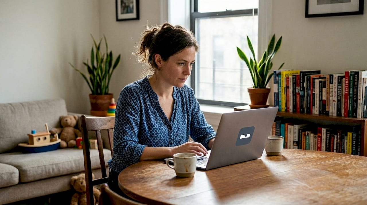
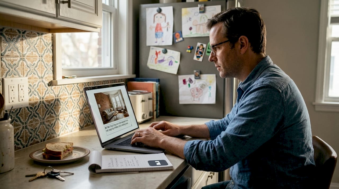
Most DIYers spend hours perfecting the lighting, color, and composition of their home renovation photos, then share them online without realizing a significant portion of their audience simply cannot access what they’ve created. Whether it’s a friend who uses a screen reader, an aging parent with low vision, or a neighbor with color blindness, your beautifully edited interior photo may be completely invisible to them. Accessible photo editing is the practice of making your images understandable and usable for everyone, and it’s far simpler than it sounds. This guide covers what accessibility means in photo editing, why it matters for DIY home projects, and exactly how to apply it.
Table of Contents
- What is accessible photo editing?
- Essential ingredients for accessible photo editing
- Common pitfalls and easy fixes in home interior photo editing
- Tools and workflows for accessible photo editing at home
- Why accessible photo editing is a must-have for every DIY renovator
- Make your home photos accessible with just a few clicks
- Frequently asked questions
Key Takeaways
| Point | Details |
|---|---|
| Accessibility means inclusion | Accessible photo editing empowers everyone to enjoy and understand your home redesigns. |
| Alt text is essential | Well-written alt text makes your interior photos usable for people with visual impairments and boosts online reach. |
| Check color and contrast | Ensuring at least a 4.5:1 contrast ratio for overlays and text guarantees readability. |
| Use the right tools | Modern apps and checkers make adding accessibility features quick and easy for DIYers. |
What is accessible photo editing?
Accessible photo editing means more than just making a photo look good. It means ensuring that anyone, regardless of ability, can perceive and understand the information your image communicates. According to Section 508 guidelines, accessible photo editing refers to creating or editing photos in ways that ensure the resulting images are accessible to people with disabilities, primarily through adding descriptive alt text, ensuring sufficient color contrast such as a 4.5:1 ratio for text, and following WCAG guidelines for non-text content.
Think of it this way: a standard renovation photo of a freshly painted living room might look stunning on screen. But if someone is using assistive technology, they hear nothing unless you’ve added alt text. If you’ve placed white text over a light background to label the paint color, someone with low vision simply cannot read it.
Here’s a quick comparison of what separates a standard home interior photo from an accessible one:
| Feature | Standard photo | Accessible photo |
|---|---|---|
| Alt text | None or generic | Descriptive, functional |
| Text contrast | Variable | Minimum 4.5:1 ratio |
| Color-only cues | Common | Avoided |
| WCAG compliance | Not considered | Built into workflow |
| Screen reader friendly | No | Yes |
The benefits go beyond compliance. User-friendly photo editing practices that prioritize accessibility also tend to improve overall image quality, SEO ranking, and audience reach. When you add descriptive alt text, you’re not just helping a screen reader user. You’re also feeding search engines the context they need to index your image properly.
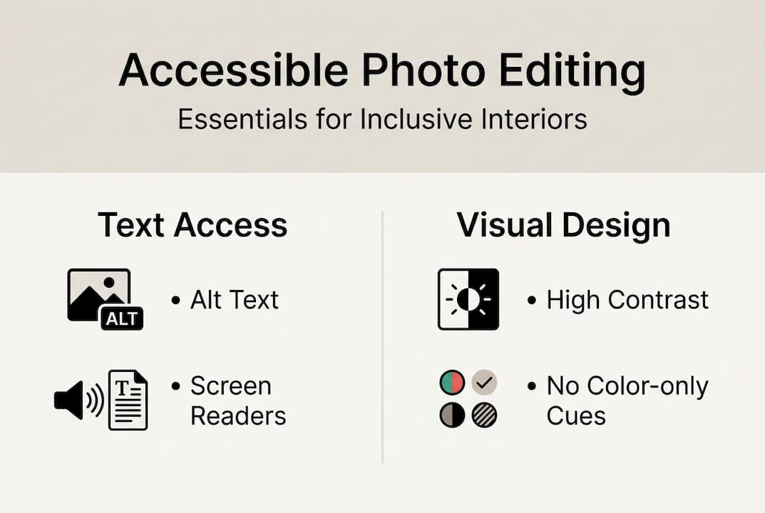
Key accessibility features every DIY home photo should include:
- Descriptive alt text that explains the room, its purpose, and notable features
- High contrast between any overlay text and the image background
- No color-only indicators, such as using red alone to mark a renovation zone
- Inline image placement so assistive tools process images in reading order
- WCAG 2.1 AA compliance as a baseline standard
Exploring photo editing app alternatives that support these features natively can save you a lot of manual work. The good news is that most modern editing tools have started baking accessibility features directly into their interfaces.
Essential ingredients for accessible photo editing
With the basics defined, let’s look at the core elements you need to make every home photo accessible. There are three pillars: alt text, color contrast, and intentional placement.
Alt text is the written description attached to an image that screen readers read aloud. According to accessible image guidelines, alt text should convey the image’s purpose concisely, ideally under 250 characters, and decorative images should use empty alt attributes. For a DIY renovator, this means describing not just what the room looks like, but what it communicates. “Freshly painted sage green living room with white crown molding and natural light” beats “living room photo” every time.
Color contrast is the ratio between the brightness of text and its background. A 4.5:1 ratio is the WCAG AA standard for normal text over images. If you’re labeling a before-and-after renovation shot with text, you need to ensure that label is readable for people with low vision. A quick fix is adding a semi-transparent dark overlay behind light text.
Here’s a practical reference for contrast requirements:
| Text type | Minimum contrast ratio | Common fix |
|---|---|---|
| Normal text over image | 4.5:1 | Dark overlay or shadow |
| Large text (18pt+) | 3:1 | Bold font, high contrast color |
| Decorative text | None required | Mark as decorative |
| UI component labels | 3:1 | Solid background |
Steps to make your next interior photo accessible:
- Plan your shot with accessibility in mind, noting what text or labels you’ll add
- Edit the photo for lighting, color, and composition using quick AI photo editing
- Add any text overlays with a contrasting background
- Write descriptive alt text before uploading
- Check contrast ratios using a built-in tool or plugin
- Export and test with a screen reader or accessibility checker
Pro Tip: Adobe Express includes a built-in contrast checker. Run your image through it before sharing to catch low-contrast text issues instantly. This DIY photo editing guide walks through many of these steps in practical detail.
Avoiding color-only cues is the third pillar. Never use color alone to signal meaning. If you’re marking a renovation zone in red, also add a label or pattern. This ensures people with color blindness can still follow your visual story.
Common pitfalls and easy fixes in home interior photo editing
Even with the best intentions, simple mistakes can leave your home photos inaccessible. Here are the most common ones and how to fix them fast.
Missing or generic alt text is the number one issue. Writing “image” or leaving the field blank tells screen reader users nothing. Be specific. Describe the room type, the key design elements, and the mood. “Bright kitchen renovation with open shelving, subway tile backsplash, and warm pendant lighting” gives someone a real mental picture.
Images with alt text rank higher in Google Image search, with 70% better odds of appearing in results. That’s a direct SEO benefit you’re leaving on the table every time you skip it.
Low contrast text over busy backgrounds is another frequent mistake. A white font over a white-walled room photo is nearly invisible. Use a dark overlay, a blurred background section, or a solid color banner behind your text. These lighting adjustment tips can also help you create cleaner backgrounds that work better for text overlays.
Here’s a quick checklist of common pitfalls and fixes:
- Missing alt text: Add a descriptive, functional description under 250 characters
- Generic alt text: Replace “photo” with specific room details and mood
- Low contrast overlays: Add a semi-transparent background behind text
- Color-only indicators: Pair color with labels, patterns, or icons
- Decorative images with alt text: Use empty alt attributes so screen readers skip them
- Images of text: Make sure the alt text matches the visible text exactly
Pro Tip: Run your finished photo through the WAVE accessibility checker before posting. It flags contrast failures, missing alt text, and other issues in seconds, saving you from problems you’d never catch by eye alone.
As the Section 508 guidelines note, decorative images should use empty alt text, images of text must match that text exactly in the alt attribute, and linked images need alt text that describes the destination. These edge cases trip up even experienced editors.
“Accessibility isn’t a feature you add at the end. It’s a habit you build from the start, and the payoff is a wider, more engaged audience for every project you share.”
This home photo editing tutorial shows how small adjustments during editing can make a dramatic difference in both visual quality and accessibility.
Tools and workflows for accessible photo editing at home
Ready to put it into action? Building accessible photo workflows doesn’t require specialist skills. It just requires a repeatable process and the right tools.
According to WCAG AA benchmarks, you should aim for 4.5:1 contrast and descriptive alt text as your baseline, and test with tools like accessibility checkers in Adobe or WAVE. These aren’t aspirational standards. They’re the floor.
Here’s a step-by-step accessible editing workflow you can follow for every home project:
- Plan: Before shooting, decide what text or labels you’ll add and how they’ll contrast with the background
- Edit: Adjust lighting, color, and composition. Use AI photo editing workflows to speed up the process
- Add overlays: Place any text with a high-contrast background behind it
- Write alt text: Draft a concise, functional description of the image before uploading
- Check contrast: Use Adobe Express, WAVE, or a browser plugin to verify your ratios
- Test: Open the image in a screen reader or paste it into an accessibility checker
- Export: Save in a web-friendly format and confirm alt text is embedded or added on upload
Tools worth knowing:
- Adobe Express: Includes built-in contrast checkers and accessibility features for image overlays
- WAVE: A free browser extension that audits any web page or image for accessibility issues
- Colour Contrast Analyser: A desktop tool for checking specific color pairs
- Screen readers (VoiceOver on Mac, NVDA on Windows): The most honest test of whether your alt text actually works
DIY Tip: Before editing your next room photo, try describing your own space out loud as if you were explaining it to someone who can’t see it. That exercise trains you to write better alt text naturally.
Why accessible photo editing is a must-have for every DIY renovator
Here’s an uncomfortable truth most photo editing advice skips entirely: focusing only on aesthetics is a form of exclusion, even when it’s unintentional. The renovation community celebrates creativity and sharing, but if your photos can’t be accessed by someone using a screen reader or someone with low vision, you’ve quietly locked them out of the conversation.
We’ve seen this firsthand. The DIY renovators who commit to accessible photo editing don’t just reach more people. They get richer feedback, more meaningful engagement, and a stronger sense that their work truly belongs to the community. Accessibility isn’t a technical checkbox. It’s an invitation.
There’s also a practical upside that rarely gets mentioned: accessible images perform better in search. Alt text boosts Google Image rankings. High-contrast photos look sharper in thumbnails. These aren’t side effects. They’re direct rewards for doing the right thing. The renovators who understand this early build audiences that grow faster and stick around longer.
Make your home photos accessible with just a few clicks
When you’re ready for expert speed and beautiful, accessible results, here’s where to start. VibeMyFlat’s AI-powered photo editor makes it easy to transform your interior photos in under 30 seconds, with guided workflows that help you visualize changes, adjust lighting, and produce share-ready results without a steep learning curve.
Whether you’re staging a room for a listing, planning a renovation, or just want to see what a new wall color looks like, VibeMyFlat gives you professional-quality edits through simple, natural language prompts. Explore more interior design tips to keep building your skills and making every photo count for every viewer.
Frequently asked questions
Why does accessible photo editing matter for home improvement photos?
Accessible photo editing ensures everyone, including people with disabilities, can visualize and benefit from your renovation projects. Accessible photo editing refers to creating or editing photos in ways that make them usable for people with a wide range of abilities.
How do I write effective alt text for an interior room photo?
Focus on the room’s purpose, main features, and mood, keeping the description concise and functional. Alt text should convey purpose and function, not just describe how something looks.
What tools help check color contrast for home photos?
Popular tools like Adobe Express, WAVE, and browser plugins help ensure sufficient contrast for overlays and text. Adobe Express includes built-in contrast checkers that make this fast and straightforward.
Should decorative images in my renovation photos get alt text?
Decorative images should use empty alt attributes to avoid cluttering screen readers. As Section 508 guidelines confirm, decorative images get empty alt text so assistive technology skips them entirely.