Top Color Palettes for Small Spaces in 2026
Top Color Palettes for Small Spaces in 2026
TL;DR:
- Choosing paint with high light reflectance values and warm undertones can make small rooms appear larger and more open.
- Applying the 60-30-10 rule and testing colors at different times enhances color harmony and room perception, especially for renters.
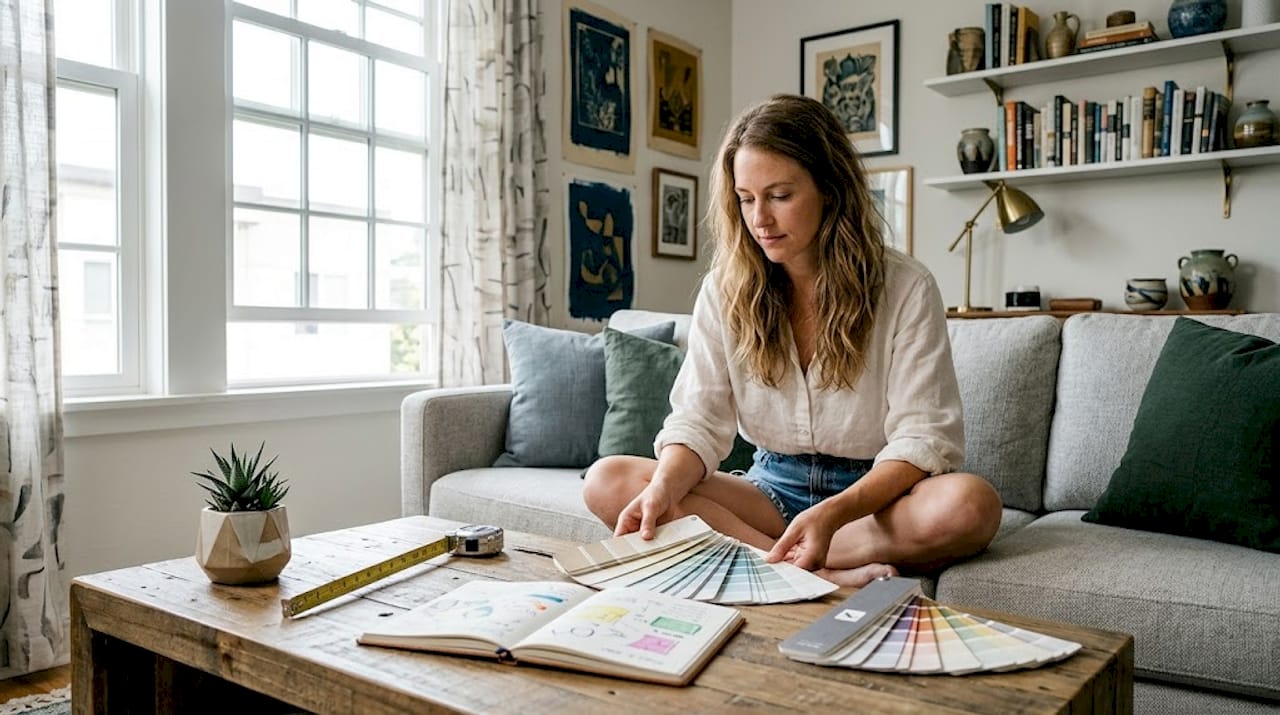
Picking paint for a small room feels deceptively simple until you’re standing there with seventeen sample swatches and no idea why the room still looks like a walk-in closet. The top color palettes for small spaces aren’t just about picking something light and calling it done. The right palette accounts for how light bounces off your walls, how warm or cool your undertones read at different times of day, and how the proportions of color interact across an entire room. Get those factors right, and even a 200-square-foot studio can feel genuinely generous.
Table of Contents
- Key Takeaways
- What every good color palette for small spaces requires
- Top 10 color palettes for small spaces
- Matching your palette to room conditions and how you use the space
- Practical tips for applying color palettes with confidence
- My honest take on why “just use white” is the wrong advice
- See your palette before you paint a single stroke
- FAQ
Key Takeaways
| Point | Details |
|---|---|
| LRV matters more than shade | Paints with light reflectance values between 70 and 85 visually expand small rooms by bouncing more light. |
| Use the 60-30-10 rule | Divide your palette into 60% dominant, 30% supporting, and 10% accent colors for intentional balance. |
| Undertones shape the feel | Warm undertones in off-whites and neutrals tend to make small spaces feel more open than stark cool whites. |
| Renters have real options | Painted trim and layered textiles recreate the effect of a full palette without permanent wall changes. |
| Test before you commit | Paint samples look different under natural light, evening light, and overhead lighting in your specific room. |
What every good color palette for small spaces requires
Before you choose a single color, two technical concepts will save you from a very expensive mistake.
The first is light reflectance value, or LRV. This is a score between 0 and 100 that measures how much light a paint color reflects back into the room. Paints in the LRV 70–85 range visually expand room volume by decreasing contrast between surfaces. A bright white with a high LRV looks open. A deep navy with a low LRV absorbs light and pulls the walls closer. Knowing a paint’s LRV before you buy removes a lot of guesswork.
The second concept is undertone. Every paint color sits on a warm or cool spectrum. Cool whites and pale grays can create noticeable shadows and edges that visually compress a small room. Warm off-whites and creamy neutrals maintain brightness without that harsh edge. This distinction matters far more than whether a color technically counts as “light.”
Once you understand LRV and undertones, apply the 60-30-10 rule. According to HGTV’s color balance guidance, your walls should carry 60% of your palette, large furnishings and rugs the next 30%, and accent pieces the remaining 10%. This framework prevents any single color from taking over while keeping the room from feeling flat.
- 60% dominant color: Walls and sometimes ceiling in your main hue
- 30% supporting color: Sofas, large rugs, curtains, cabinetry
- 10% accent color: Throw pillows, art, small decor objects
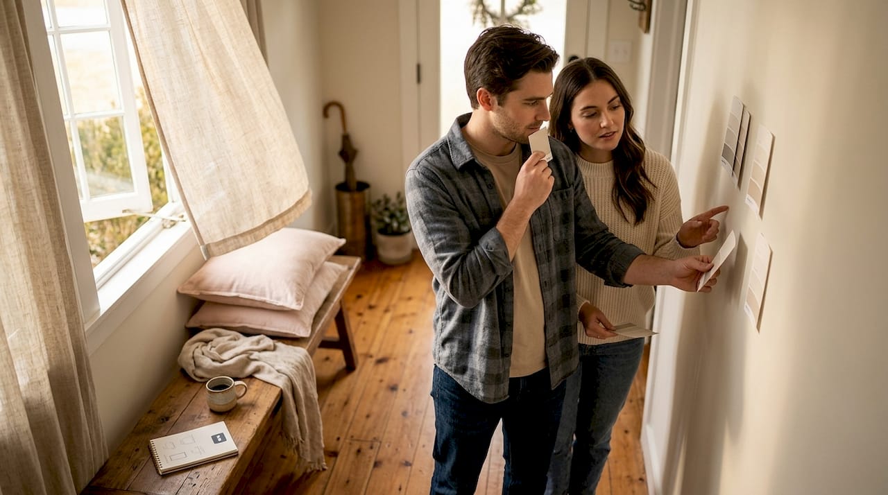
Pro Tip: Paint a 12-inch square sample directly on your wall and observe it at three different times of day. Morning light, afternoon sun, and evening lamp light will all shift how the color reads, and what looks perfect at noon can feel muddy by 8 pm.
Top 10 color palettes for small spaces
1. Warm off-white with natural linen and blush
This is the palette most designers reach for first. An off-white with yellow or beige undertones (think Benjamin Moore’s “White Dove” territory) holds the 60% wall role. Warm linen tones carry the furniture, and a soft blush accent in cushions or ceramics adds personality without fighting for space. The result is bright, cohesive, and never cold.
2. Misty blue with warm white trim and sand
Soft blues and misty greens create a visual receding effect where the walls appear further away than they are. Using warm white trim prevents the palette from reading too cool, while a sandy beige in upholstery grounds the room. This combination works especially well in bedrooms and bathrooms with moderate natural light.
3. Sage green with cream and terracotta
Sage and muted moss tones function as near-neutrals. They add depth and warmth without the high-contrast drama of a bold color. Pair sage walls with cream furnishings and a single terracotta accent, and the room feels grounded and layered. This palette reads differently depending on the light, shifting from olive-warm in morning sun to quiet green-gray in the evening.
4. Warm gray with charcoal and brass
Gray gets a bad reputation for feeling cold and corporate, but a gray with visible brown or purple undertones behaves completely differently. Warm gray walls in the LRV 70-plus range create a soft backdrop for charcoal sofas or dark bookshelves. Brass accents in lighting or hardware add warmth without cluttering the palette. This combination suits living rooms in north-facing spaces where you need warmth without going full color.
5. Dusty lavender with white and soft gold
Lavender reads surprisingly neutral at lower saturation. A dusty, muted version of the color sits between pink and gray, making it flattering in bedrooms and home offices. White trim keeps the room crisp, and soft gold accents in frames or lamp bases stop the palette from feeling flat. This is one of the more underrated color schemes for small rooms because it adds character without demanding a lot of attention.
6. Pale blush with warm ivory and copper
Think of this as the warm cousin to the classic white room. Blush walls with an LRV above 75 read almost as a tinted neutral in most lighting. Warm ivory furnishings blend without creating sharp contrast, while copper accents in a floor lamp or plant pot add just enough edge to keep the room feeling considered. This palette suits small living spaces and bedrooms equally well.
Pro Tip: If your room has one strong feature like a bay window, fireplace, or architectural detail, treat that wall as your accent plane and pull the bolder 10% color there rather than spreading it across the room.
7. Off-white with navy trim and natural oak
This palette flips convention. Instead of putting color on the walls, you use a warm off-white for the dominant 60% and reserve the navy for painted trim and a few strategic furniture pieces. The effect is sophisticated and surprisingly space-enhancing because the light walls reflect generously while the dark trim adds architectural definition. Renters especially benefit from this approach since it often requires painting only baseboards and window surrounds, not full walls.
8. Warm white with eucalyptus and matte black
Eucalyptus sits between sage and seafoam and works as an accent color that reads like a plant or a texture rather than a statement. Against warm white walls, it reads organic and calming. Matte black accents, used very sparingly in the 10% role, add contrast and sophistication. This palette photographs exceptionally well and suits small kitchens and home offices where you want calm focus.
9. Greige with dusty rose and dark walnut
Greige is gray-beige, and it earns its popularity in small-space design because it adapts to both warm and cool light conditions. At LRV values in the mid-70s, it keeps rooms bright without the starkness of white. Dusty rose in the 30% supporting role, applied through a large sofa or area rug, brings warmth. Dark walnut wood in furniture or frames adds the contrast needed to stop the palette from looking washed out.
10. Deep teal with warm white ceiling and aged brass
Deep teal breaks the “keep everything light” rule and wins. When a rich color is applied consistently across all four walls with very high-LRV white on the ceiling and trim, the room feels cocooning and intentional rather than cramped. Aged brass accents in lighting and fixtures tie the palette together. This option works best in small rooms with good natural light or rooms where you want a bold, deliberate atmosphere like a home bar, reading nook, or powder room.
Matching your palette to room conditions and how you use the space
Choosing from the list above is just the starting point. The palette that works beautifully in your neighbor’s south-facing bedroom may feel flat and lifeless in your north-facing studio. Here is how to match palette to conditions.
| Palette | Best room type | Light conditions | LRV range | Undertone |
|---|---|---|---|---|
| Warm off-white, linen, blush | Any room | All directions | 78-85 | Warm |
| Misty blue, warm white, sand | Bedroom, bathroom | East or west facing | 65-75 | Cool to neutral |
| Sage, cream, terracotta | Living room, kitchen | South or east facing | 65-72 | Warm |
| Warm gray, charcoal, brass | Living room, office | North facing | 70-78 | Warm |
| Deep teal, white ceiling, brass | Powder room, nook | South facing | 25-45 (walls) | Cool |
| Greige, dusty rose, walnut | Bedroom, living room | Any direction | 72-80 | Neutral |
South-facing rooms receive warm, yellow-toned light throughout the day. Cooler undertones in your dominant color balance that warmth without making the room feel sterile. North-facing rooms receive cooler, more diffuse light, so warm undertones in your walls compensate naturally.
For renters who cannot paint walls, the 60-30-10 rule is fully achievable through textiles alone. A large area rug in your dominant color, furniture in your supporting color, and accent cushions or art in your accent color recreates the proportional effect of a painted palette.
- Painted trim is a low-commitment, renter-adjacent option where only baseboards and window frames get color
- Large wall art in your palette’s supporting color substitutes for painted walls in rental settings
- Removable wallpaper panels can introduce the dominant color on a single accent wall without permanent change
Pro Tip: In small rooms, bold colors work best when they are contained to surfaces that recede: the back wall of a bookshelf, the interior of a built-in, or the wall opposite the entry. This concentrates the visual impact without closing in the space.
Practical tips for applying color palettes with confidence
Getting the palette right on paper is half the battle. Here is how to make it land in the actual room.
Sheen and finish matter more than most people realize. The same color in different finishes produces different levels of brightness and glare. In small rooms, matte or eggshell finishes on walls reduce glare and make the color feel consistent across different lighting conditions. Reserve semi-gloss for trim, where durability and a clean definition are more valuable.
Layered lighting complements your palette and changes how it reads after dark. Ambient overhead light, a task lamp on a desk or reading chair, and one accent light near a plant or artwork give you three different ways to experience the same palette. For more on how layered lighting works in small spaces, the interaction between light temperature and paint undertone is especially important to understand.
- Use warm-temperature bulbs (2700K to 3000K) with warm undertone palettes
- Use neutral-temperature bulbs (3500K to 4000K) with cool or neutral undertone palettes
- Dimmer switches let one room serve double duty as a bright workspace and a calm evening retreat
- Mirrors placed opposite light sources multiply the effect of high-LRV paint by bouncing that light again
You can also enhance interiors through textiles in ways that reinforce your palette without requiring any paint at all. A well-chosen area rug often does more structural work for a palette than the wall color itself.
My honest take on why “just use white” is the wrong advice
I’ve worked with color in small spaces long enough to say this clearly: the reflexive advice to “just paint everything white” produces more disappointing rooms than almost any other mistake.
Plain white, especially a cool bright white, creates sharp contrast at every edge and corner. In a small room, those edges multiply. The result often reads as a clinical box rather than an open, airy space. Undertone temperature shapes spatial perception far more than brightness alone. A warm off-white with an LRV of 80 will feel more generous than a cool stark white at the same LRV because the warm undertone softens those edges.
What I’ve found actually works is this: treat color balance as the primary decision and specific color as secondary. A room where the 60-30-10 proportions are well-executed in almost any palette will feel more intentional and spacious than a room painted a “correct” color with no thought given to how the furniture and textiles interact with it.
The palettes that have surprised me most are the deeper ones, specifically a well-placed teal or moody sage used consistently across all four walls. When you commit fully rather than hedging with a single accent wall, the room stops feeling like a container and starts feeling like a destination. That shift in atmosphere is worth more than a few extra perceived square feet.
— Hello
See your palette before you paint a single stroke
Choosing between ten strong palettes and committing to one without seeing it in your actual room is where most people get stuck. This is exactly what Vibemyflat’s AI photo editor was built for.

Upload a photo of your room, describe the palette you want to try, and the AI renders the change in under 30 seconds. You can switch from warm off-white to deep teal, test painted trim in navy, or preview sage walls against your existing furniture. The platform understands how light reflectance and undertones interact, so the previews read true rather than flat. For anyone working through small space paint ideas before a weekend project, it removes the guesswork entirely. Try it on any device and make your palette decision with confidence.
FAQ
What colors make small rooms feel bigger?
Colors with LRV values between 70 and 85 and warm undertones work best in small rooms. Soft blues, misty greens, warm off-whites, and muted blush tones all expand perceived space.
How do I choose colors for a north-facing small room?
North-facing rooms receive cooler, diffuse light, so choose warm undertone palettes: warm gray, off-white with yellow undertones, or muted sage paired with cream furnishings.
Can renters apply color palettes without repainting?
Yes. Renters can apply the 60-30-10 rule through rugs, textiles, and furniture to replicate the proportional effect of a painted palette. Painted trim is another low-commitment option that requires minimal surface coverage.
What finish should I use on small room walls?
Matte or eggshell finishes control glare and keep color consistent in small rooms. Semi-gloss is better reserved for trim and architectural details where definition and durability matter more.
Is it possible to use dark colors in small spaces?
Yes, when deep colors are applied consistently across all four walls with light-colored ceilings and trim, the room feels intentional rather than cramped. Deep teal and moody sage work especially well in small rooms with good natural light.