Wall Color Inspiration: Best Ideas for 2026
Wall Color Inspiration: Best Ideas for 2026
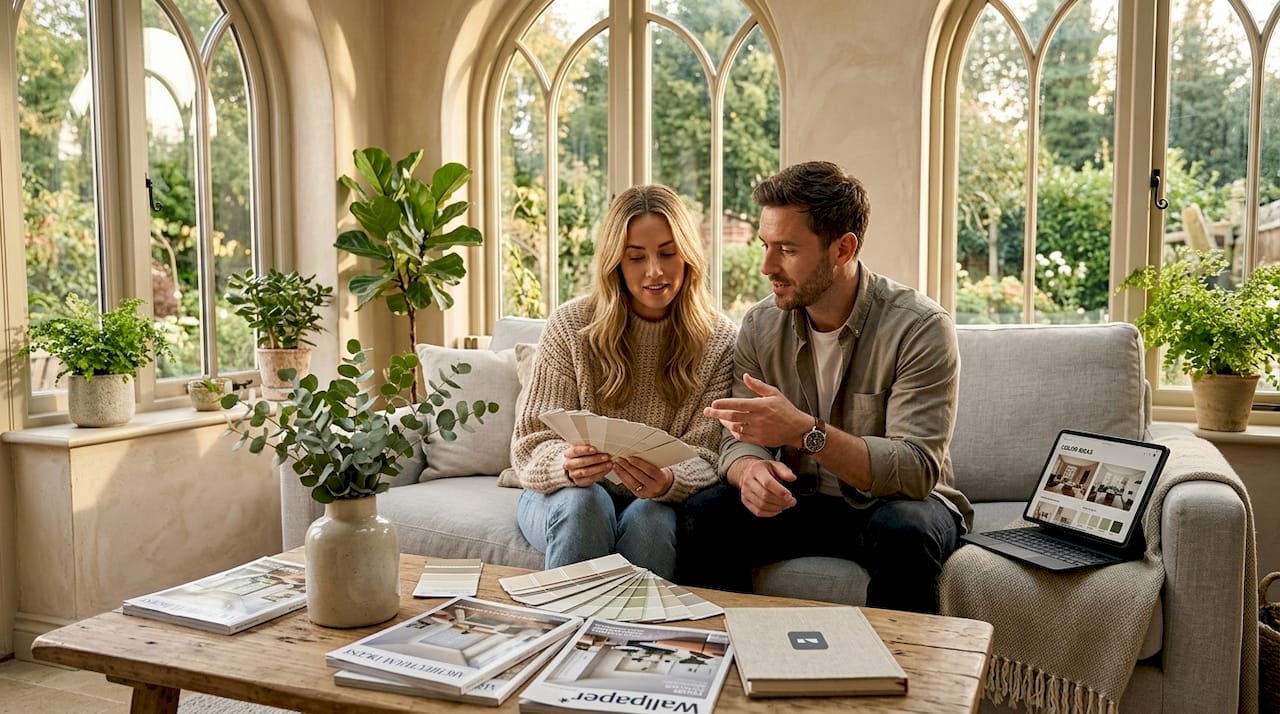
TL;DR:
- Wall color inspiration involves choosing hues that transform a space’s atmosphere, reflect personal style, and respond to lighting conditions. The 2026 trend leans toward warm neutrals like creams and mushroom tones, complemented by accent colors such as sage green, terracotta, and navy, which add personality without overwhelming. Testing large swatches under different lighting conditions and in various room areas ensures color choices harmonize with natural and artificial light before final application.
Wall color inspiration is the creative process of selecting paint hues that transform a room’s atmosphere, reflect personal style, and respond to the specific conditions of your space. The 2026 design shift moves decisively toward warmer, earthier neutrals, with accent colors like sage green, terracotta, and deep navy adding personality without overwhelming a room. Getting color right means understanding three forces working together: the color category you choose, how your room’s light behaves, and how you test before you commit.
1. What are the essential color categories for wall inspiration?
Every strong room color scheme starts with understanding the three main paint categories: warm neutrals, accent hues, and tonal layering. Each plays a different role in shaping how a space feels.
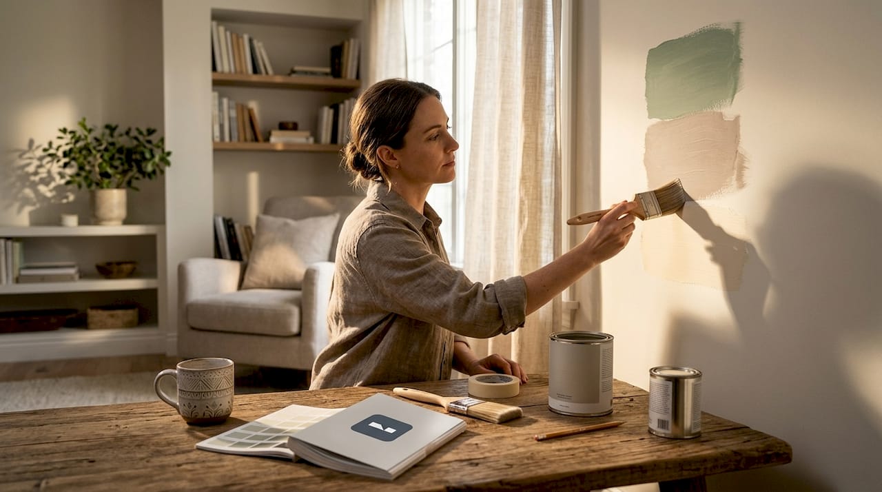
Warm neutrals are the workhorses of interior paint ideas. Creams, beiges, and mushroom tones create adaptable, calming backdrops that age well and pair with almost any furniture style. Warm tones pair better with wood, textiles, and natural light than cool whites, which is why designers consistently reach for them over stark, blue-leaning whites.
Accent hues bring character to a space. The most popular accent colors for 2026 include:
- Sage green: calming, organic, works in bedrooms and kitchens
- Terracotta: warm and grounding, ideal for living rooms and entryways
- Deep navy: dramatic and sophisticated, strong in home offices and dining rooms
- Blush pink: soft and airy, flattering in bedrooms and bathrooms
- Charcoal gray: modern and versatile, pairs with almost any neutral base
- Soft mustard yellow: energizing without being aggressive, good for accent walls in social spaces
- Forest green: rich and immersive, excellent for creating a cozy reading nook or study
Tonal layering is the most underused technique in home color planning. Gradient walls using at least three shades of one color family add depth and architectural interest without introducing a second color. The standard approach: paint baseboards the strongest tone, walls the mid-tone, and the ceiling the lightest shade. The result feels intentional and sophisticated, not busy.
Pro Tip: When building your color palette inspiration, start with one fixed element in the room, such as a sofa, rug, or wood floor, and pull your neutral and accent choices from the tones already present in that piece.
2. How lighting and room size influence wall color choices
Light is the single most underestimated variable in choosing wall colors. The same paint chip can look warm and inviting in one room and cold and flat in another, purely because of how light enters the space.
Room orientation matters significantly. North-facing rooms show cooler undertones while south-facing rooms amplify warm undertones. This means a beige that looks creamy and golden in a south-facing living room can read as a dull gray-green in a north-facing bedroom. Knowing your room’s orientation before selecting a color saves you from a costly repaint.
Here is a practical approach to accounting for light when choosing your wall color:
- Identify your room’s orientation. North and east-facing rooms need warmer paint tones to compensate for cooler, bluer light. South and west-facing rooms can handle cooler tones without the space feeling cold.
- Observe the room at three points in the day. Morning light is soft and warm, midday light is bright and neutral, and evening light shifts toward amber. A color that works at noon may look entirely different at 7 p.m.
- Account for artificial lighting. Incandescent bulbs push yellow and orange tones into a color. LED bulbs with a color temperature above 4000K add blue. Test your swatch under the actual bulbs you use in the room.
- Factor in room size. Light paint colors make small rooms feel larger by reducing visual contrast and pushing walls back visually. Darker colors have the opposite effect, creating a more enclosed, intimate feel. For small space color palettes, lighter values in the same hue family consistently outperform bold choices.
- Choose your sheen deliberately. Flat paints absorb light and mute color while glossier sheens reflect light and brighten the perceived hue. Eggshell or satin finishes work well for most walls because they balance both effects without looking clinical.
Pro Tip: Paint a large swatch on both a well-lit wall and a shadowed corner of the same room. The difference between those two spots tells you more about how the color will live in your space than any chip at the paint store.
3. Which wall colors and palettes are trending in 2026
The 2026 trend toward warmer, earthier neutrals reflects a broader design philosophy: rooms should feel grounded and calming, not sterile or performatively bold. Here are the top trending colors across different room types and moods.
| Color | Tone | Best Room | Mood |
|---|---|---|---|
| Sherwin-Williams Shoji White (SW 7042) | Warm off-white | Living room, bedroom | Calm, timeless |
| Benjamin Moore Glacier White (OC-37) | Soft neutral white | Any room | Clean, airy |
| Mushroom / greige | Muted warm brown | Living room, hallway | Grounded, modern |
| Sage green | Muted mid-green | Kitchen, bedroom | Organic, restful |
| Terracotta | Warm burnt orange | Entryway, living room | Energetic, earthy |
| Deep navy | Rich dark blue | Office, dining room | Dramatic, focused |
| Blush pink | Soft warm pink | Bedroom, bathroom | Gentle, romantic |
| Charcoal gray | Dark cool neutral | Office, accent wall | Sophisticated, modern |
| Soft mustard yellow | Warm golden yellow | Kitchen, accent wall | Cheerful, warm |
| Forest green | Deep saturated green | Study, reading nook | Immersive, cozy |
Timeless neutrals like Shoji White and Glacier White work across architectural periods because they carry just enough warmth to feel inviting without reading as yellow or beige. They are the safest starting point for anyone building a room color scheme from scratch.
For those who want more personality, the accent hues above each serve a specific emotional function. Sage green calms. Terracotta grounds. Navy focuses. Choosing an accent color based on how you want to feel in a room, rather than just how it looks in a photo, produces results that hold up over time.
Pro Tip: Before committing to a trending color, check how it looks in your room at night under artificial light. Many bold accent colors that photograph beautifully in daylight turn muddy or flat under warm incandescent bulbs.
4. Best practices for testing and applying your color choices
Skipping the test phase is the most common and expensive mistake in any paint project. Testing paint colors under different lighting conditions reduces costly mistakes and maximizes final satisfaction. Here is a reliable process:
- Paint large swatches directly on the wall. A 12-inch square is the minimum. A 2-foot by 2-foot swatch is better. Small chips held up to a wall in a paint store bear almost no relationship to how a full coat will look in your home.
- Apply two full coats. One coat of test paint shows the undertone but not the true depth of the color. Two coats give you an accurate preview of the finished result.
- Check the swatch at morning, midday, and evening. Natural light shifts throughout the day cause colors to reveal different undertones at each point. A color that looks perfect at noon may feel wrong by 8 p.m.
- Test in both lit and shadowed areas. Place swatches on at least two walls in the room, one that receives direct light and one that stays in shadow. This previews the full range of how the color will behave.
- Use the same sheen finish you plan to use for the final coat. Satin finish may look lighter and more vibrant compared to flat, so testing with a different finish gives you inaccurate data.
For guidance on the full process of editing wall colors before picking up a brush, Vibemyflat’s design guides walk through each step in practical detail.
5. How to combine and layer wall colors for cohesive interiors
A single great color rarely makes a room. The relationship between your base color, supporting tones, and accent shades determines whether a space feels pulled together or accidentally assembled.
A palette system distributing color hierarchy between dominant, supporting, and accent shades prevents mismatched or overwhelming color schemes. The dominant color covers the most surface area, typically the main walls. The supporting color appears on trim, built-ins, or a secondary wall. The accent color shows up in small doses on a single feature wall, furniture, or textiles.
Practical strategies for combining colors well:
- Use monochromatic gradients for subtle sophistication. Painting walls, trim, and ceiling in three values of the same hue creates depth without introducing color conflict. This works especially well with warm neutrals and greiges.
- Choose analogous accent walls. Colors that sit next to each other on the color wheel, like sage green and warm yellow, create harmony without tension. Complementary pairings (opposite on the wheel, like navy and terracotta) create contrast and energy, which works in social spaces but can feel restless in bedrooms.
- Anchor your palette to permanent room features. Wood floors, stone countertops, and fixed tile are the colors you cannot change. Building a controlled color hierarchy anchored to those permanent elements avoids the “pretty color, wrong room” problem.
- Balance bold colors with neutrals. A deep navy accent wall reads best when the remaining three walls are a warm off-white or light greige. Surrounding a bold color with neutrals lets it breathe and do its job without overwhelming the space.
- Match color intensity to room function. High-energy colors suit kitchens, home offices, and entryways. Lower-saturation, softer tones suit bedrooms and bathrooms where the goal is rest and recovery.
For rooms where you want to explore 2026 design trends beyond color alone, layering wall color with updated lighting and textiles multiplies the visual impact significantly.
Key takeaways
The most effective wall color inspiration strategy combines a warm neutral base, a purposeful accent hue, and rigorous on-wall testing across multiple lighting conditions before any final commitment.
| Point | Details |
|---|---|
| Start with warm neutrals | Creams and mushroom tones like Shoji White work across rooms and pair well with natural materials. |
| Test on the actual wall | Paint 2-foot swatches with two coats and check at morning, midday, and evening light. |
| Match color to room function | Use calming, low-saturation tones in bedrooms and bolder hues in social or work spaces. |
| Use a three-tier palette | Assign dominant, supporting, and accent roles to prevent color schemes from feeling chaotic. |
| Account for sheen and finish | Test with the same finish you plan to use, since satin reads lighter and more vibrant than flat. |
Why I stopped trusting paint chips entirely
The most useful thing I have learned about choosing wall colors is that the chip is a lie. Not intentionally, but structurally. A one-inch square of color under fluorescent store lighting, held against a white card, tells you almost nothing about how that color will perform on 200 square feet of wall in a room with north-facing windows and warm wood floors.
The shift that changed everything for me was treating color selection as a time-based experiment rather than a visual one. You are not choosing a color. You are choosing how a color behaves across a full day in a specific room. That reframe makes the testing process feel less tedious and more like gathering real data.
I have also come to trust warm neutrals more than I expected to. They photograph poorly compared to bold accent colors, but they live better. A mushroom-toned wall at 6 p.m. under warm lamplight is one of the most genuinely comfortable things a room can offer. Bold colors are exciting in photos and exhausting in daily life, unless the room’s function genuinely calls for energy.
The one place I consistently push people toward bolder choices is the room they use least, like a powder room, a home office, or a reading nook. Low daily exposure means the color stays exciting rather than becoming background noise. That is where deep navy, forest green, and terracotta earn their place.
— Hello
See your wall color ideas before you paint
Choosing the right wall color is much easier when you can see the result before opening a single can of paint. Vibemyflat lets you upload a photo of your room and visualize any color, palette, or finish in under 30 seconds using plain language descriptions. No design software, no guesswork.

Whether you are testing a warm neutral against your existing furniture or previewing a bold accent wall in your living room, Vibemyflat’s AI processes your photo and returns a professional-quality result instantly. Visit vibemyflat.com to start visualizing your color choices today, and explore the full library of design guides to build a palette that works for your specific space, light, and style.
FAQ
What is the most popular wall color for 2026?
Warm off-whites and earthy neutrals lead 2026 trends, with Sherwin-Williams Shoji White and Benjamin Moore Glacier White cited most frequently by designers. Sage green and terracotta are the top accent choices.
How do I choose a wall color for a small room?
Light paint colors reduce visual contrast and make small rooms feel larger. Stick to warm whites, soft creams, or light greiges, and avoid dark or highly saturated colors that push walls inward visually.
Should I test paint colors before committing?
Testing is non-negotiable. Paint a 2-foot by 2-foot swatch with two coats directly on the wall and check it under morning, midday, and evening light before making a final decision.
What wall colors work best in a north-facing room?
North-facing rooms receive cooler, bluer light that amplifies cool undertones in paint. Choose warm-toned neutrals, creams, or soft yellows to counteract the light and keep the space from feeling cold.
How many colors should a room color scheme include?
A three-tier system works best: one dominant color for main walls, one supporting tone for trim or secondary surfaces, and one accent color for a feature wall or textiles. More than three colors in one room typically creates visual noise rather than depth.